
Choosing the Mat
The purpose of a mat is to lead the eye to the artwork. A mat creates a neutral zone between the visual interest of the frame and the artwork itself. At the same time, the mat's color can affect our experience of the art, either by drawing our attention to some particular color, or by isolating the art so that nothing intrudes on the artist's original intention.
Mats are more than decoration, mats also provide a functional role by separating the art from the glass to protect the art. In humid conditions, the small air space keeps any condensation on the inside surface of the glass from touching the print. This prevents mildew, paper buckling and color loss. Our museum-quality, acid-free mats will retain their color and protect your artwork for many, many years.
The basic rules of how big a mat should be is decided by the frame. The recommendation is that the width of the mat should be at least double the size of the with of the frame. A sturdy frame would need a wider matte than a thin one. Apart from that, the mat can be just about any size. A small format picture, let's say 4" x 5" , can look brilliant in an 18" x 24" mat and frame.
A few tips when selecting a mat:
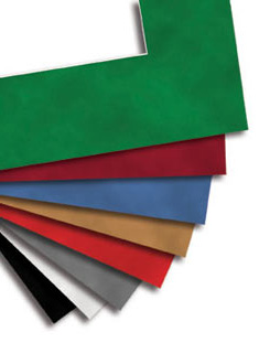
- Dark colors tend to contain the art, while light colors tend to expand it.
- Strong colors tend to connect the artwork to the frame so that art, mat and frame feels like a single unit.
- A very common use of cream colored mats is to choose two slightly different colored creams to form a double mat.
- By using more than one mat, you can create special effects with color. The thin color border draws attention to the image, helps create a smooth transition between the frame and the art, and adds a touch of class to the whole piece.
- Single mats are often used on abstract art, contemporary art, and posters. They give the artwork a sleek, clean, fashionable look.
- Mats should be at least twice as wide as the frame width. In a multiple mat combination, that means the top mat.
- Vary the amount showing on each mat in multiple mat combinations to avoid "striping."
- The top mat can be whatever color is predominant in the art. You can also use a neutral top mat with lower mats as accent colors.
- Fine art pieces look best with double mats. In traditional museum style matting, both mats are light, neutral tones. The bottom mat (showing a thin strip of color) can be the same color as the top mat, but is usually slightly lighter or darker. Gold is very often used as a bottom mat with museum pieces, especially if the frame is gold.